The Business Challenge
The deposits business at Axis bank through a recent user focus group study discovered that there were significant UX issues with current digital journey to book a Fixed of Recurring deposit. They had arrived at the conclusion that these UX issues were severely impacting the business success and needed expert UX help.
• One of the key issue around the FD/RD booking journey was around the discovery of deposits as a section and also to identify the right deposit type with respect to customer needs. Lack of discoverability around this are was creating significant bounce.
• The second issue area was around the ease of booking form, which thwarted users or did not motivate them to book larger deposit amounts at one go.
• The third area was around management of deposits, where the bank was losing customer deposits, as customers were exiting for some reason or the other.
A culmination of these challenges, spawning from user psychology and foundational usability was creating a repeated business impact, which was imperative to be resolved through design intervention.
Crafting the experience strategy
The strategy to create business outcomes is always based on deep customer understanding. An illustration of customer behavior, that really explains why they are not doing what the business wants them to. The design team, discovered such hidden gems while excavating true user behaviors as part of a user study.
Insights We understood that customers are often not acting upon excess cash lying in their savings account as they don’t feel the pain of their money shrinking. They also find the process of choosing a deposit hard, with too many choices, and apprehension to park larger sums of their money. Very often customers break their deposits when they need cash and lose out on their interest.
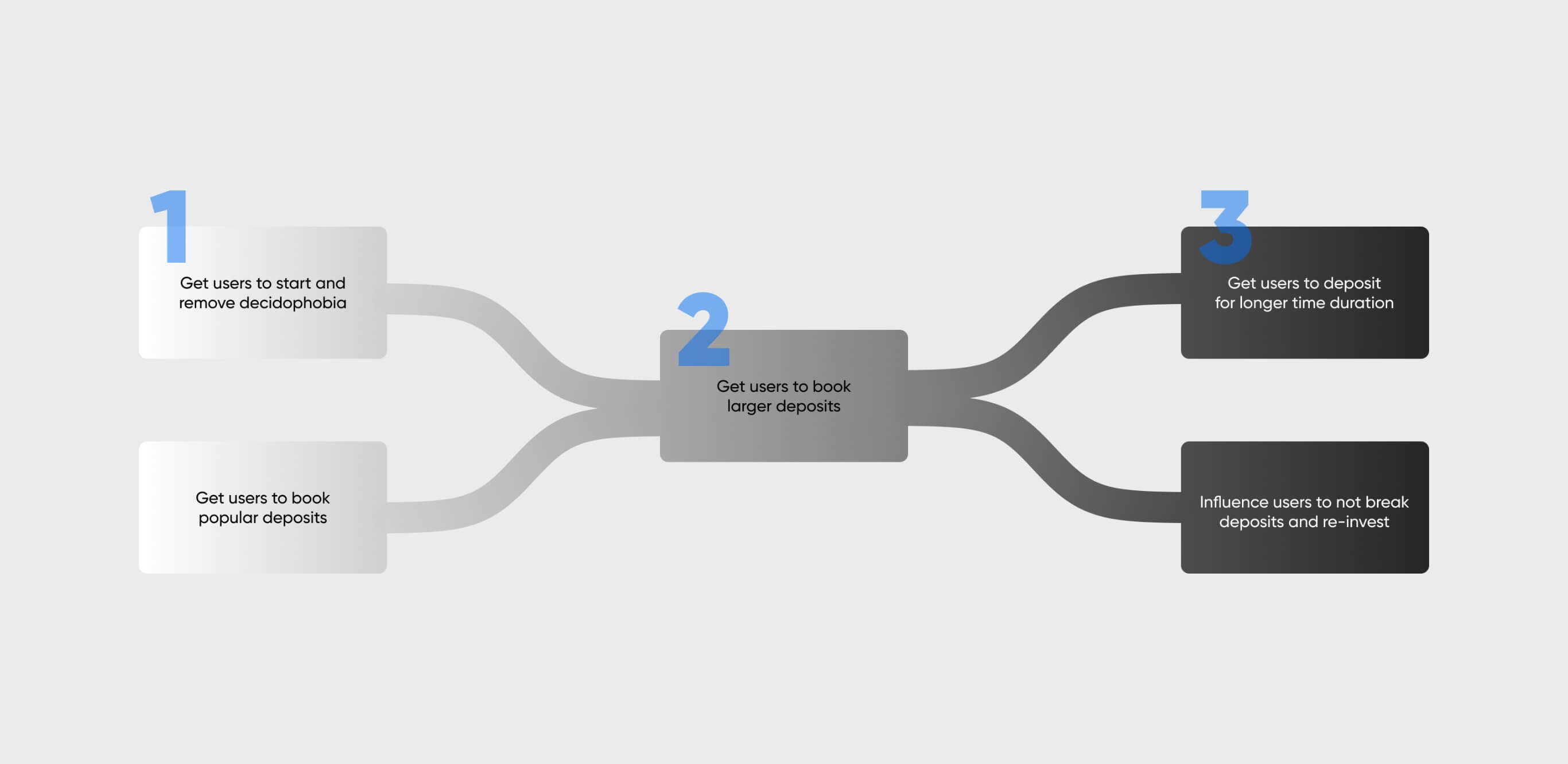
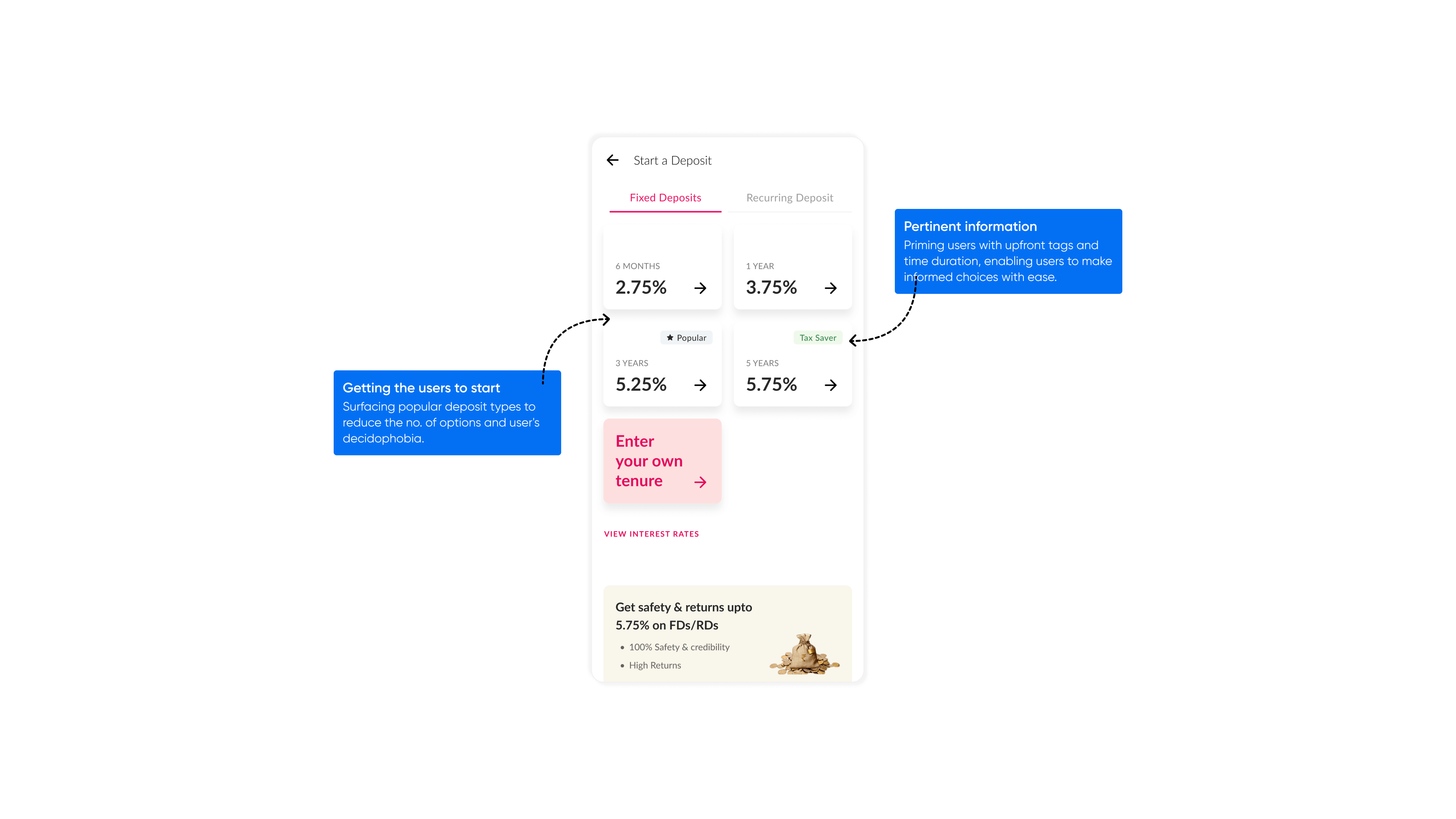
How to get the users to start and book a deposit How to get the users to start and book a deposit The team crafted a strategy to create upfront motivation and remove decidophobia by making deposits visually apparent. Based on available data we knew that users tend to choose 3 types of deposit maturity and surfaced just those to remove decidophobia.
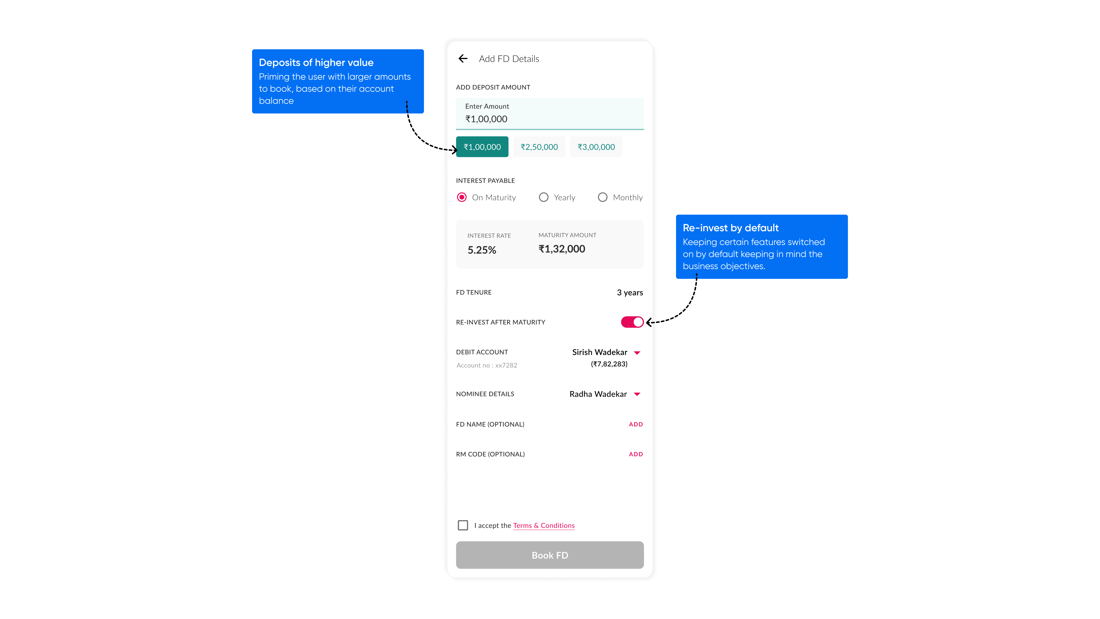
Getting users to book larger deposits Once the user was pulled in, the form design was transformed to ask questions which map to how customers think about deposits. We carefully embedded some design ‘suggestion’ techniques, using which user’s were primed on what amount they should park in the deposit to gain the best interest. From semantically similar sounding deposit types to lot of technical terms were simplified such that comprehension became easier. To reduce the cognitive load even further, we took decisions on the behalf of the users basis what is commonly chosen as an option.
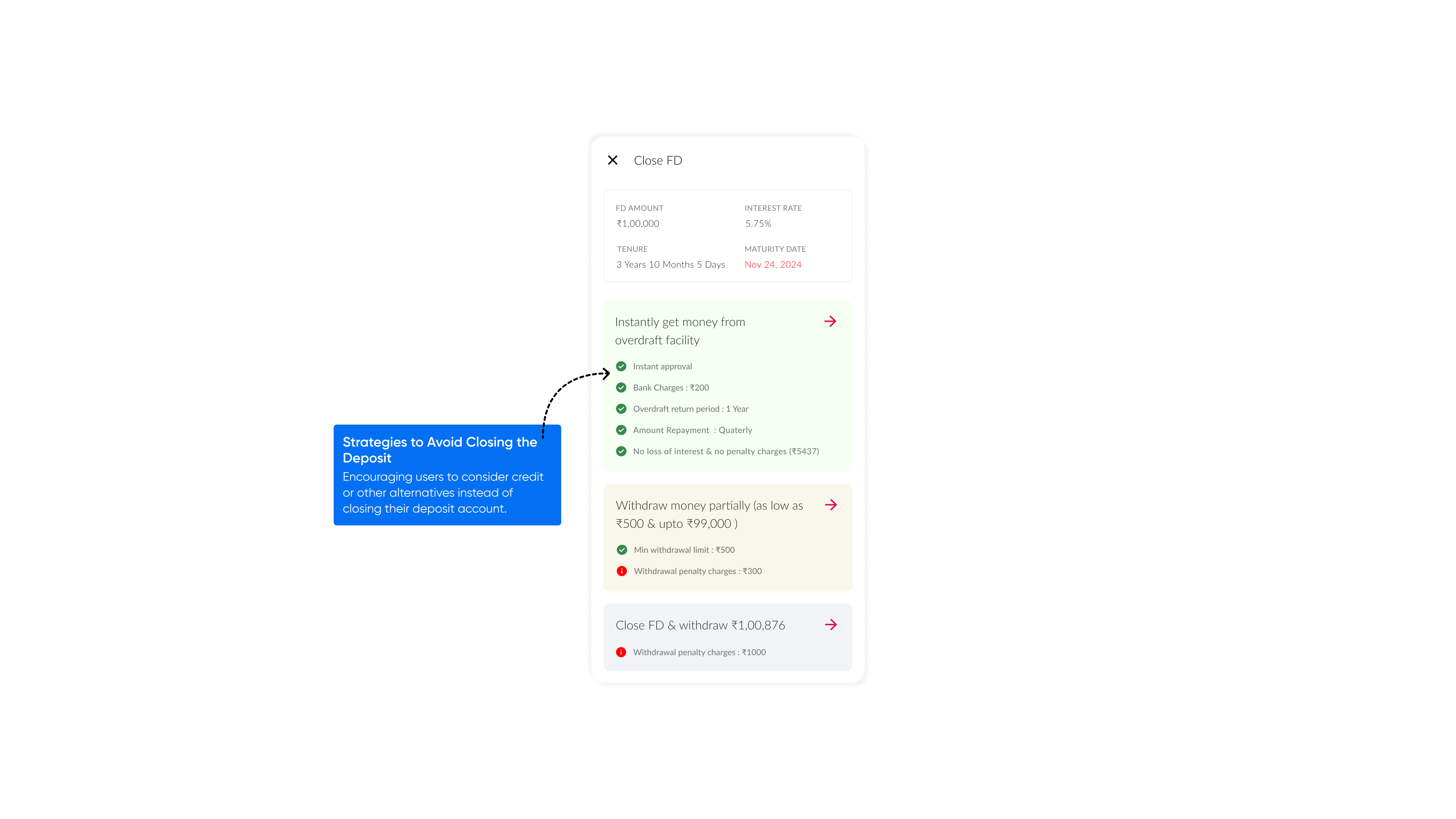
To prevent pre-mature exits from the booked deposits, customers were guided to take credit against their deposit as to not lose the interest they stood to gain.
Crafting such an experience strategy which spanned the deposit, discovery, booking, and management lifecycle creating an explosive business outcome and tremendous ease of use for the bank customers.

Experience Innovations
In our relentless pursuit of enhancing the platform's user experience, we have implemented crucial experience strategies that have yielded remarkable results.
Here are a few noteworthy examples of the carefully crafted and executed strategies that have significantly improved user engagement, streamlined processes, and aligned seamlessly with both user and business requirements. The end result is a booking experience for fixed deposits (FD) and recurring deposits (RD) that is not only seamless but also personalized to cater to individual preferences and needs.
Outcomes Delivered
The outcomes of our innovation have surpassed expectations, showcasing remarkable results and impressive numerical figures that highlight the success of our endeavors.


